Green Grocer Project
GreenGrocer is a mobile application designed to provide users with a seamless and enjoyable experience while shopping for high-quality, healthy food items. I would like to highlight the use of different design methodologies to maintain order and good communication with the developers and the team in general. Many of these decisions make it easier to translate design into code and ensure that from the beginning we all use the same building blocks for each design solution.
Design Thinking
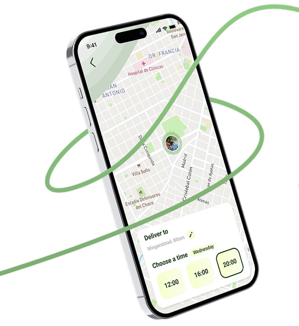
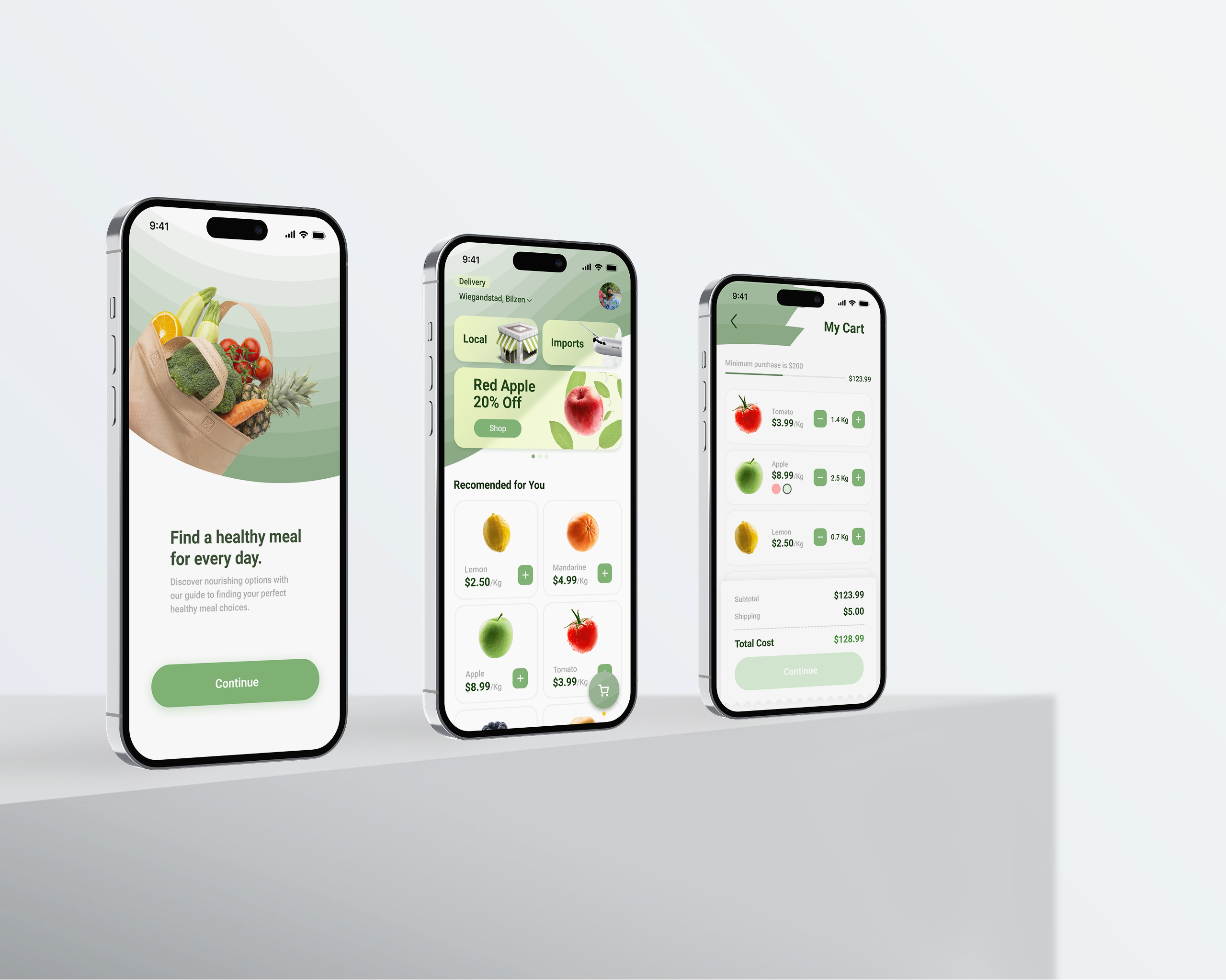
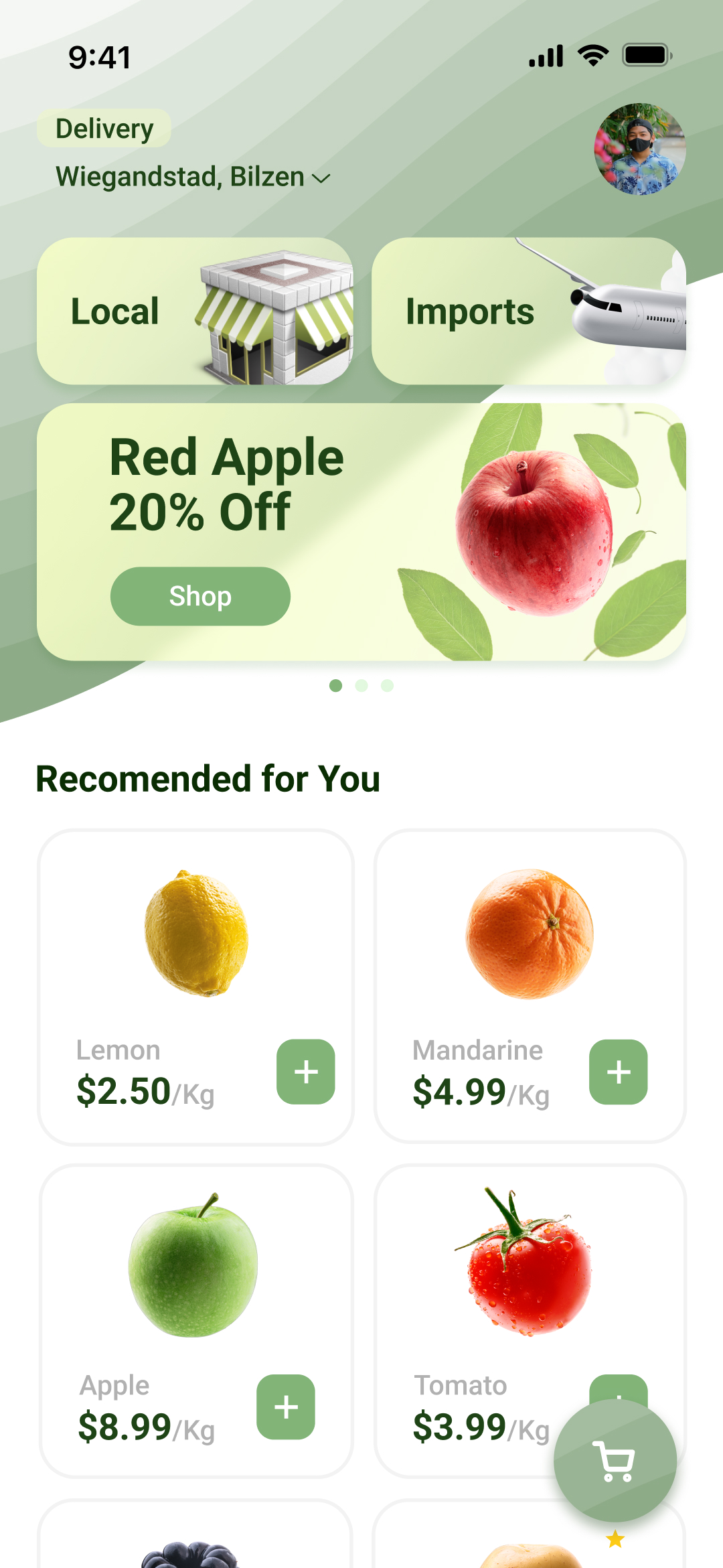
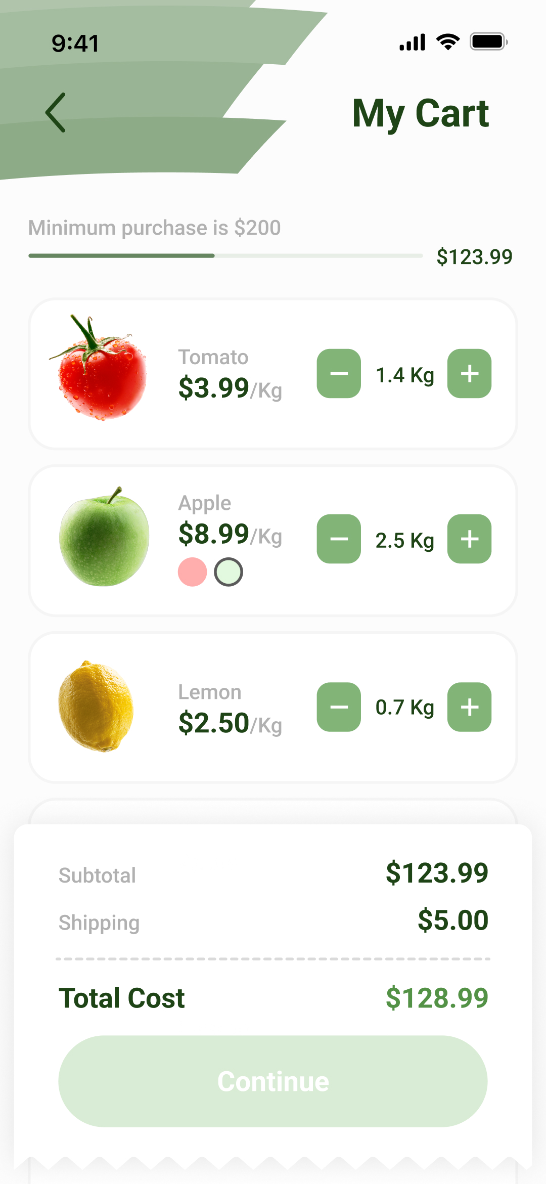
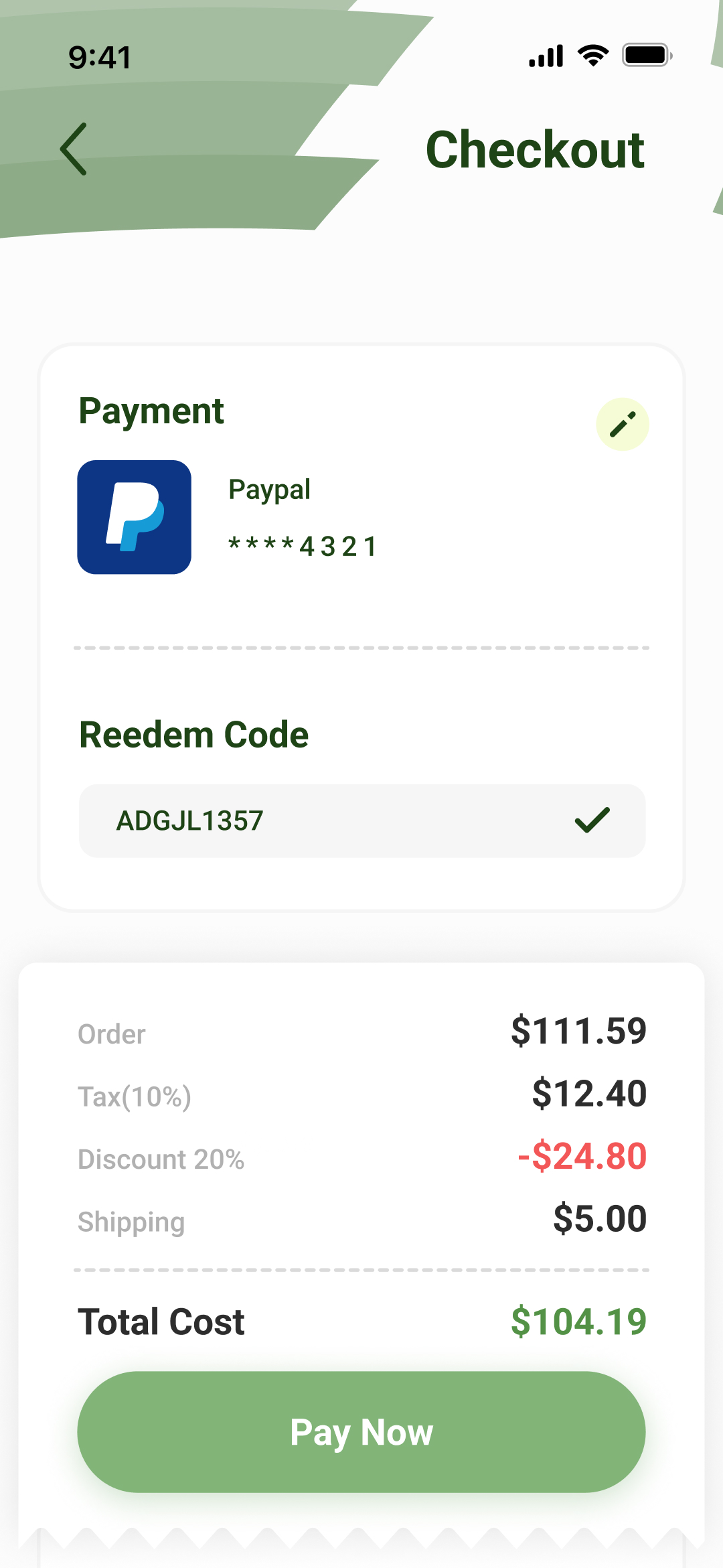
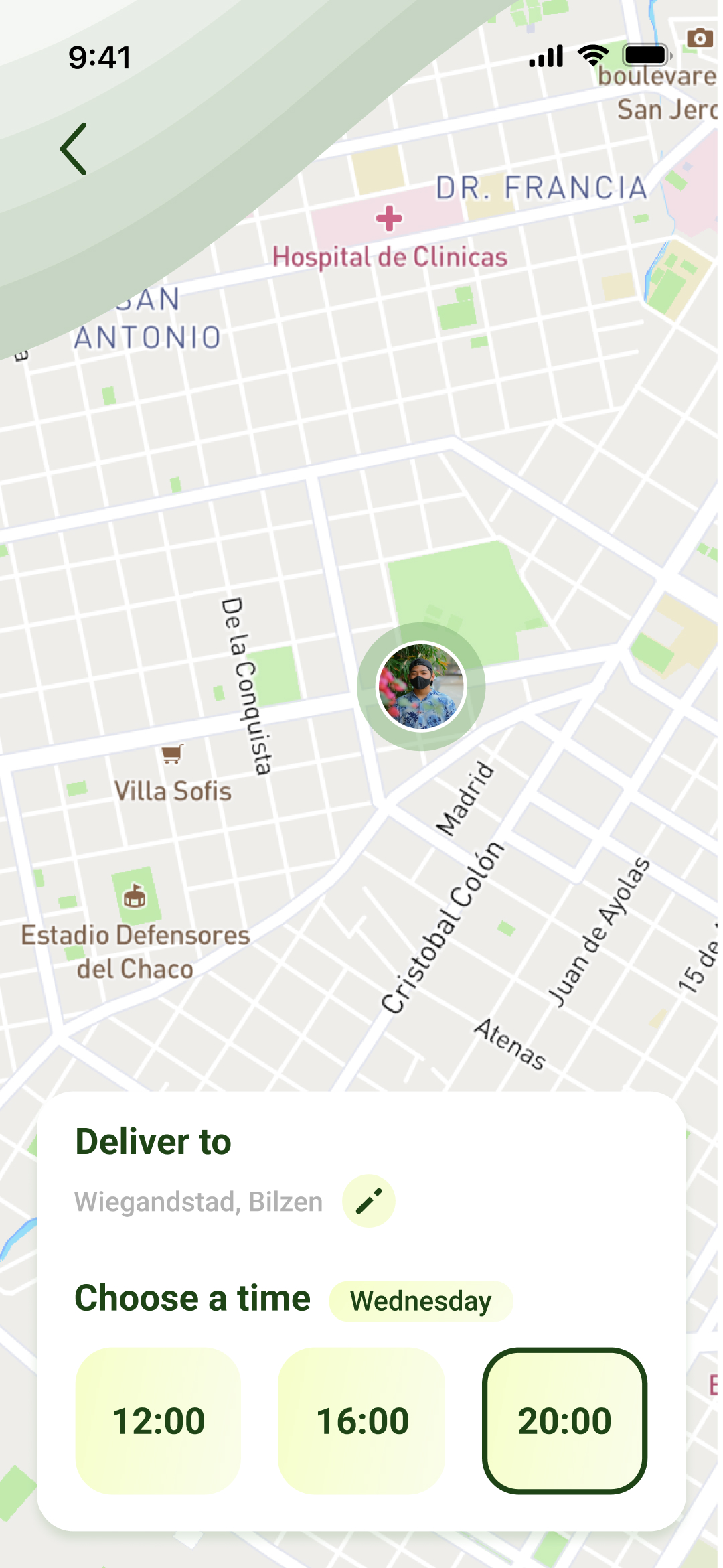
Thanks to the research stage, it was determined that for the shopping app to be successful, it should be visually quite simple but with the important elements always easily accessible. Both features such as scheduled deliveries and the checkout page focus on what is important to the user at each step of the process.
The idea of understanding how the user’s thought process works when making a purchase helps the design team achieve the business goals.
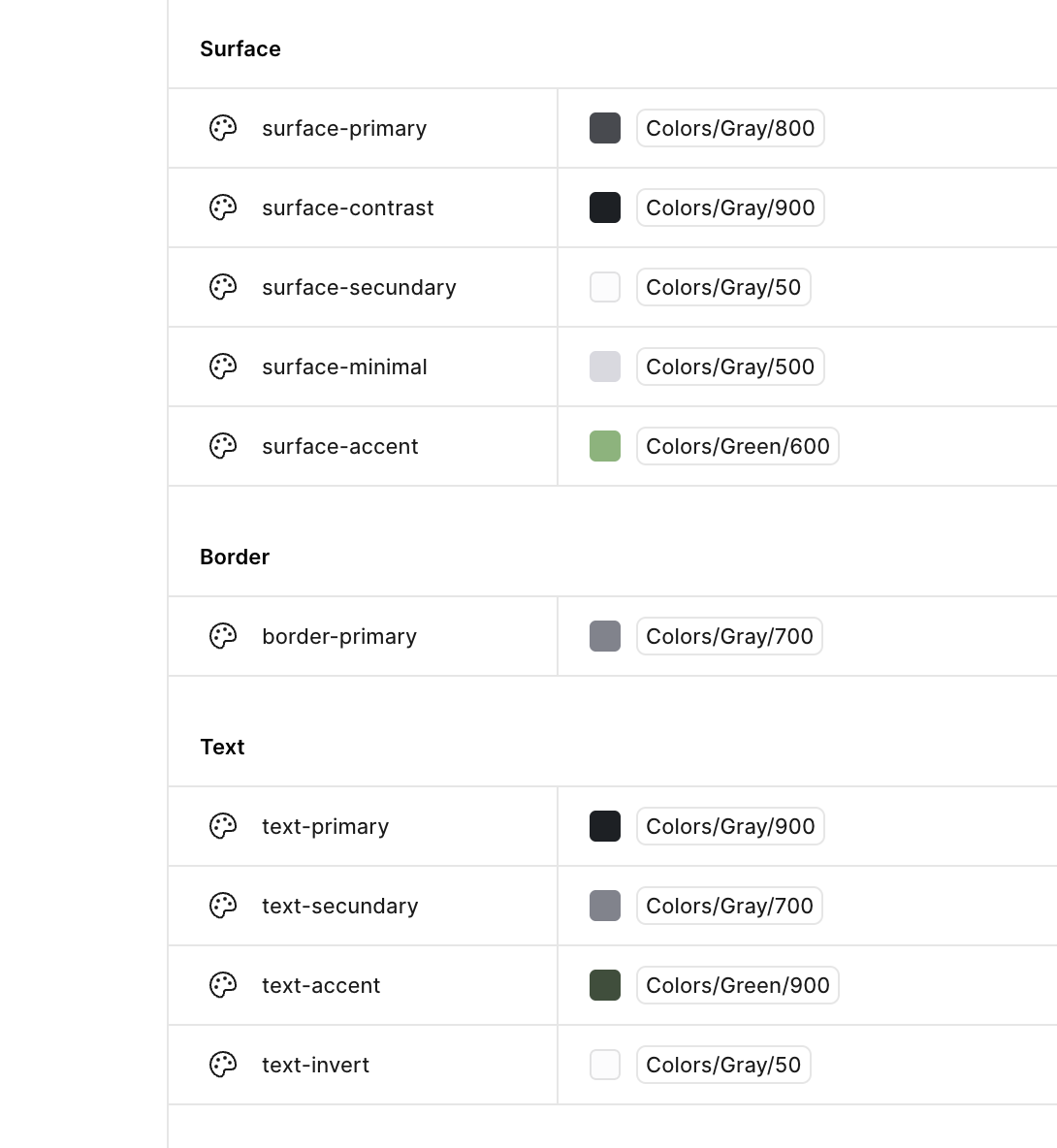
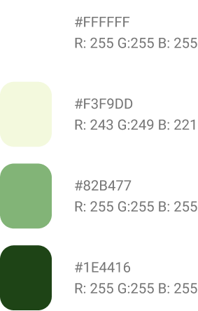
One of those tools used, for example, is Design Tokens, which standardize both the color palette and the use of spacing and sizes in each element, and are easily translatable into code.
Visual Style
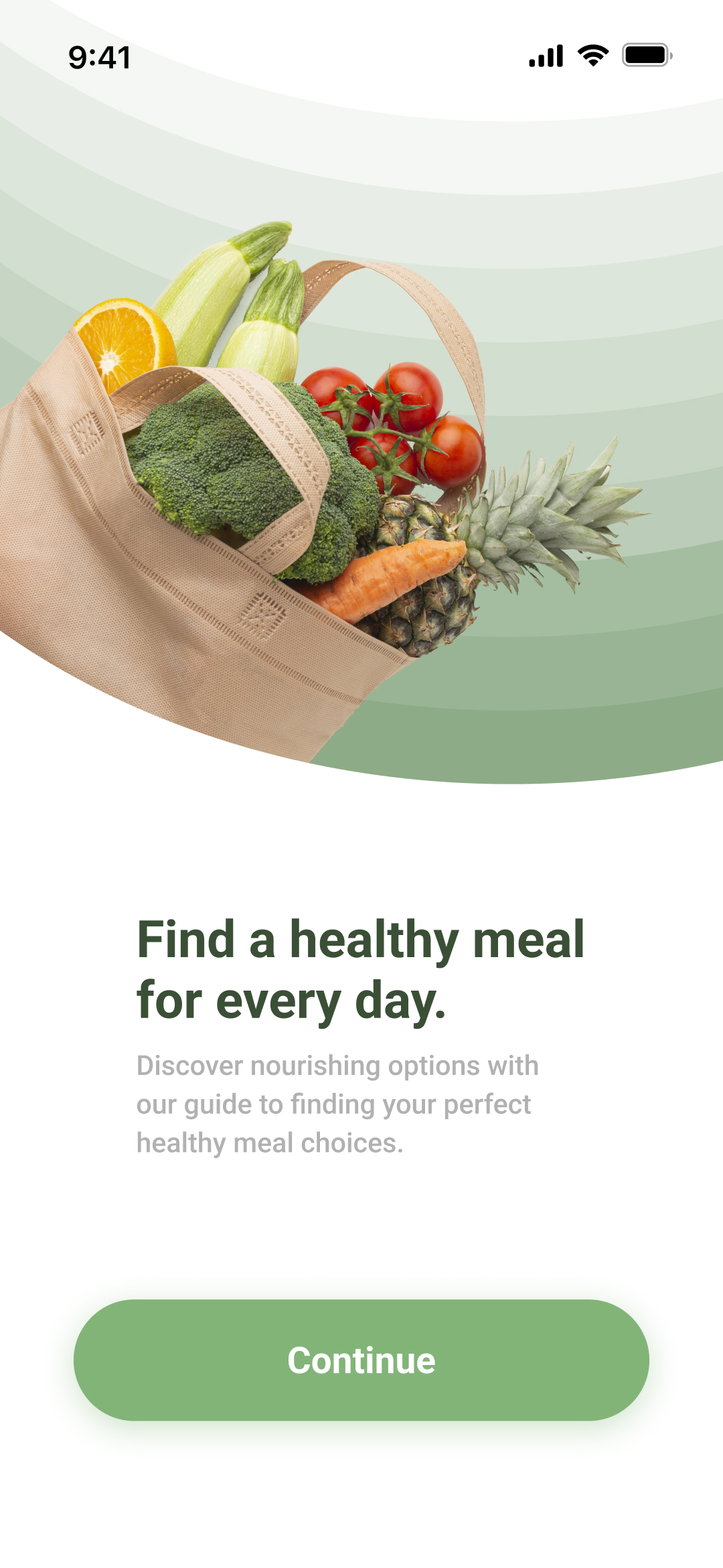
To create a visual style that is easy to understand, the most important thing is to maintain the consistency and context of each element. It’s like having a favorite restaurant not just because of the good food, but because it consistently delivers the same experience every time. In design, consistency creates recognizable patterns that help make every action easier.
In summary, this project includes many decisions made with usability in mind, every color and typeface has a purpose aligned with the business goals, making it unique while achieving the warmth that helps users focus on the shopping experience. If you liked the Design Thinking behind this project and would like to know more, feel free to send me a message!

Green Grocer Project
GreenGrocer is a mobile application designed to provide users with a seamless and enjoyable experience while shopping for high-quality, healthy food items. I would like to highlight the use of different design methodologies to maintain order and good communication with the developers and the team in general. Many of these decisions make it easier to translate design into code and ensure that from the beginning we all use the same building blocks for each design solution.
Design Thinking
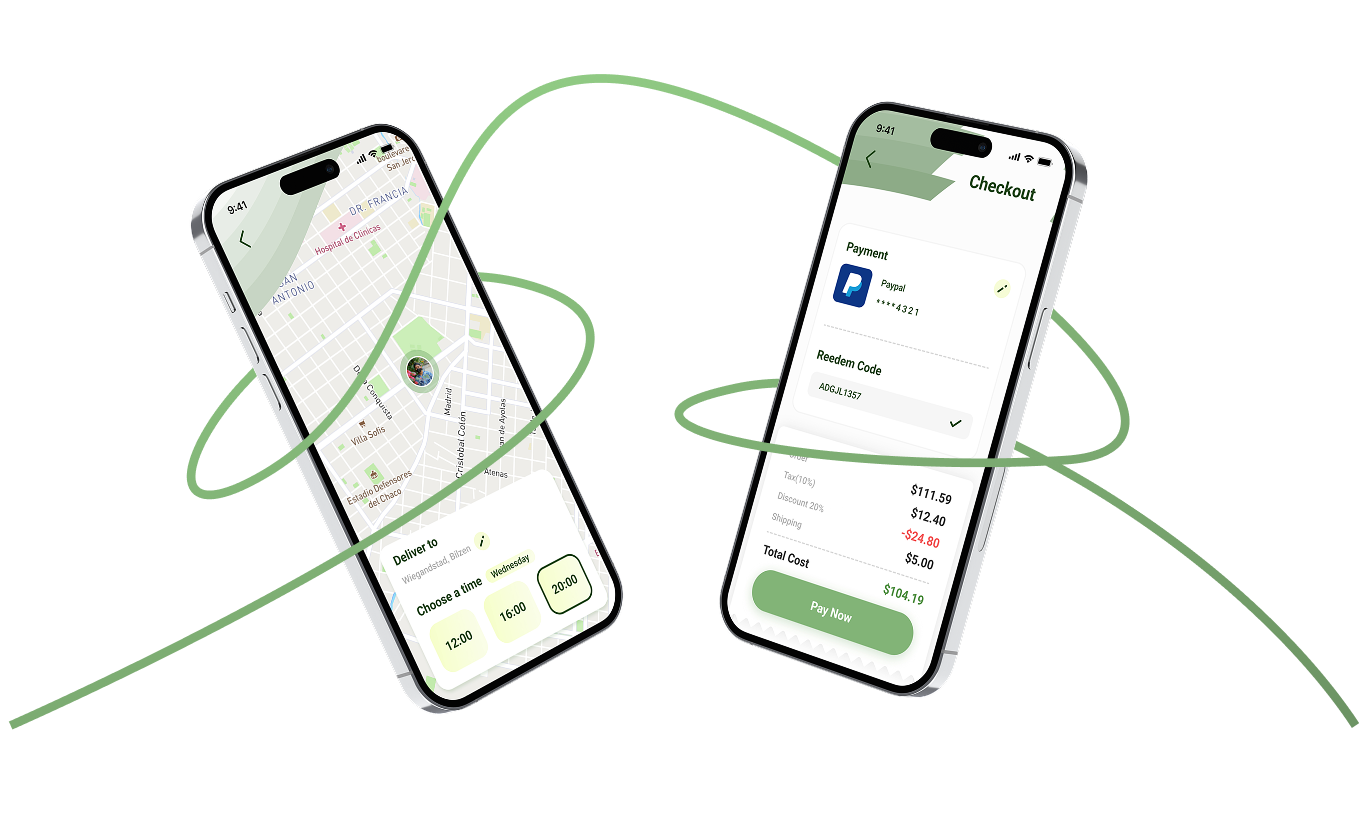
Thanks to the research stage, it was determined that for the shopping app to be successful, it should be visually quite simple but with the important elements always easily accessible. Both features such as scheduled deliveries and the checkout page focus on what is important to the user at each step of the process.
The idea of understanding how the user’s thought process works when making a purchase helps the design team achieve the business goals.
One of those tools used, for example, is Design Tokens, which standardize both the color palette and the use of spacing and sizes in each element, and are easily translatable into code.
Visual Style
To create a visual style that is easy to understand, the most important thing is to maintain the consistency and context of each element. It’s like having a favorite restaurant not just because of the good food, but because it consistently delivers the same experience every time. In design, consistency creates recognizable patterns that help make every action easier.
#FFFFFF
#F3F9DD
#82B477
#1E4416
R: 255 G:255 B: 255
R: 243 G:249 B: 221
R: 255 G:255 B: 255
R: 255 G:255 B: 255
Aa
Roboto
0 1 2 3 4 5 6 7 8 9 ! @ # $ % & * / ( ) _ +
Aa Bb cc Dd Ee Ff Gg Hh li
Kk LI Mm Nn oo Pp Qq Rr ss
Tt vv xx Yy zz
In summary, this project includes many decisions made with usability in mind, every color and typeface has a purpose aligned with the business goals, making it unique while achieving the warmth that helps users focus on the shopping experience. If you liked the Design Thinking behind this project and would like to know more, feel free to send me a message!
Green Grocer Project
GreenGrocer is a mobile application designed to provide users with a seamless and enjoyable experience while shopping for high-quality, healthy food items. I would like to highlight the use of different design methodologies to maintain order and good communication with the developers and the team in general. Many of these decisions make it easier to translate design into code and ensure that from the beginning we all use the same building blocks for each design solution.
Design Thinking
Thanks to the research stage, it was determined that for the shopping app to be successful, it should be visually quite simple but with the important elements always easily accessible. Both features such as scheduled deliveries and the checkout page focus on what is important to the user at each step of the process.
The idea of understanding how the user’s thought process works when making a purchase helps the design team achieve the business goals.
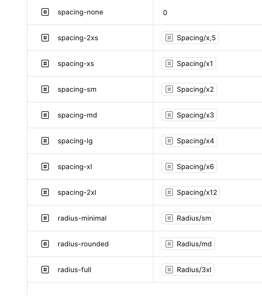
One of those tools used, for example, is Design Tokens, which standardize both the color palette and the use of spacing and sizes in each element, and are easily translatable into code.
Visual Style
To create a visual style that is easy to understand, the most important thing is to maintain the consistency and context of each element. It’s like having a favorite restaurant not just because of the good food, but because it consistently delivers the same experience every time. In design, consistency creates recognizable patterns that help make every action easier.
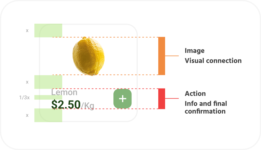
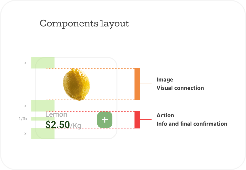
Components layout
x
x
1/3x
x

Lemon
$2.50/Kg


Image
Visual connection
Action
Info and final confirmation
when building each element for the app, these values were taken into account, which helped to better balance the hierarchy of what should be given attention
#FFFFFF
#F3F9DD
#82B477
#1E4416
R: 255 G:255 B: 255
R: 243 G:249 B: 221
R: 255 G:255 B: 255
R: 255 G:255 B: 255
Aa
Roboto
0 1 2 3 4 5 6 7 8 9 ! @ # $ % & * / ( ) _ +
Aa Bb cc Dd Ee Ff Gg Hh li
Kk LI Mm Nn oo Pp Qq Rr ss
Tt vv xx Yy zz
In summary, this project includes many decisions made with usability in mind, every color and typeface has a purpose aligned with the business goals, making it unique while achieving the warmth that helps users focus on the shopping experience. If you liked the Design Thinking behind this project and would like to know more, feel free to send me a message!